|
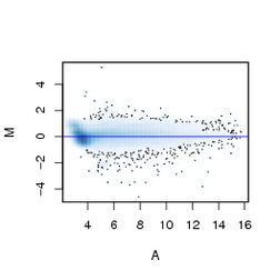
| Figure 5.5: MA-plot of the firstarray in the normalized data CCl4sn. The scatterplot in theleft panel uses an individual dot for each data point. The right panelshows a smooth density representation of the data, individual pointsare drawn only in the sparse regions. |