```{r echo = FALSE}
options(markdown.HTML.options = "toc")
```
# AnalysisPageServer Interactivity
Not only does the AnalysisPageServer display your data and plot, it
also implements sorting, numeric and text filtering, selecting and
tagging points, zoom, full screen mode, and download. Using the example
data set this document will walk you through each of these interactions.
The interactions are very easy to learn, and you will probably
discover many of them just by playing with the example data set.
----------------
## Working through this guide
This is a step-by-step guide. To work your way through it, simply
click on this link to open the page in a new window or tab, then
follow through the steps of the guide. Or, just read through the guide
and look at the screenshots.
Open Example Data Set
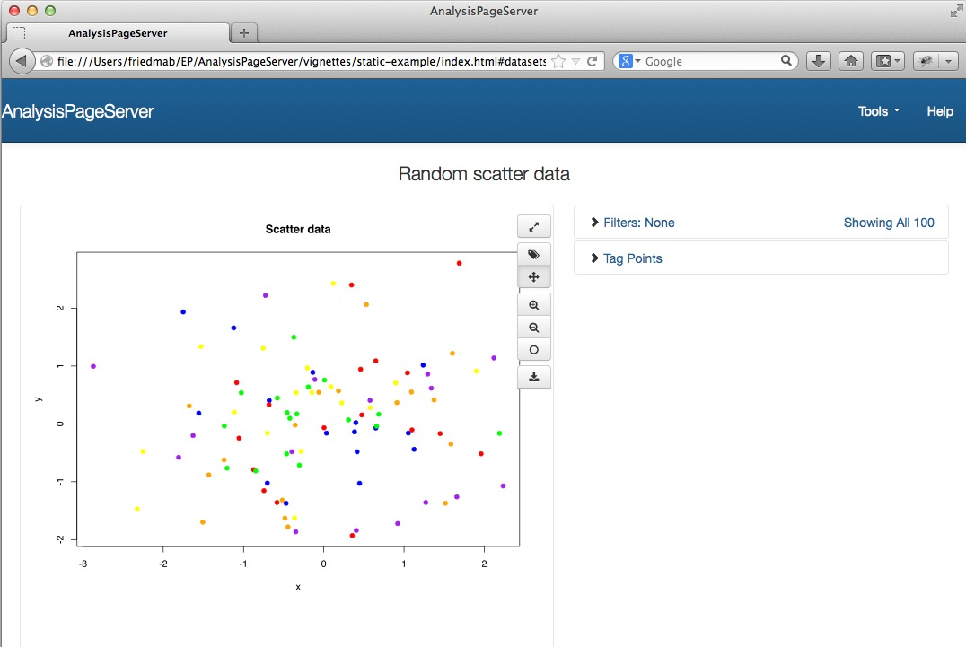
When you first open the link, it looks
like this:
 ## Roll-over
Rolling over any point in the plot reveals the meta-data associated
with the plot.
 ## Zooming
Zooming is done most easily with your mouse roller, which will zoom
in/out focusing on the point where your mouse is hovering.

 If you
get lost then you can always press the `0` key or click on the "reset
zoom" button, which is the bottom button from the group of zoom
controls (pictured at right). Above the "reset zoom" button are the
incremental "zoom in" and "zoom out" buttons which can be used
instead of the mouse roller zoom.
## Panning
 Once you've zoomed in you might want to move about. If you are in "pan
mode" then you can drag the plot to move it around. The mode
toggles between "pan mode" and "tag mode" (more on "tag mode"
later). "pan mode" is repesented by a 4-way arrow, and "tag mode" by a
tag. Whichever button is depressed is the mode that you are in. For
example, picture at the right shows "pan mode". If you are in the
wrong mode just click on the other button to switch.
## Full screen mode
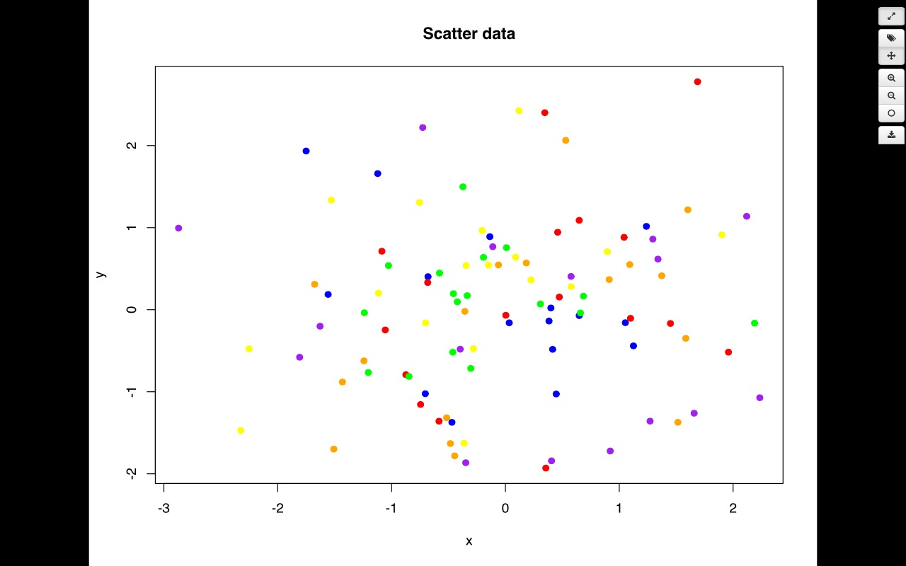
Clicking on the *full
screen* button
  will expand your plot to fill the whole screen,
along with the control buttons. This can be very useful
to see more details. Rollover, panning, zooming
and selective tagging (more on this later) all work
in full screen. Click the full screen mode button
or press the `Esc` key to exit full screen.
 ## Data Table
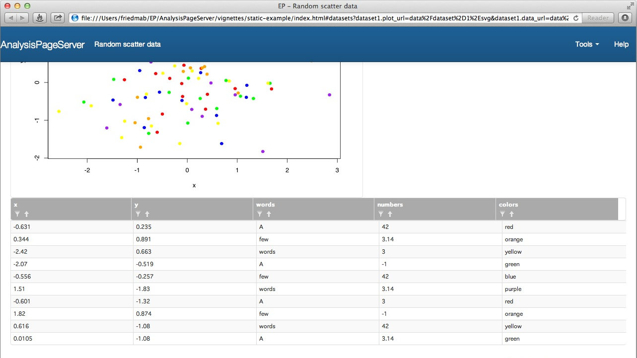
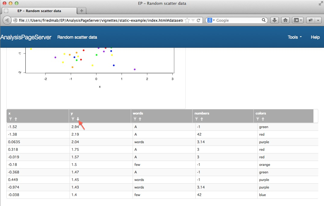
Scroll down the web page and you will see a table of your attached
data:
 ### Column Summaries
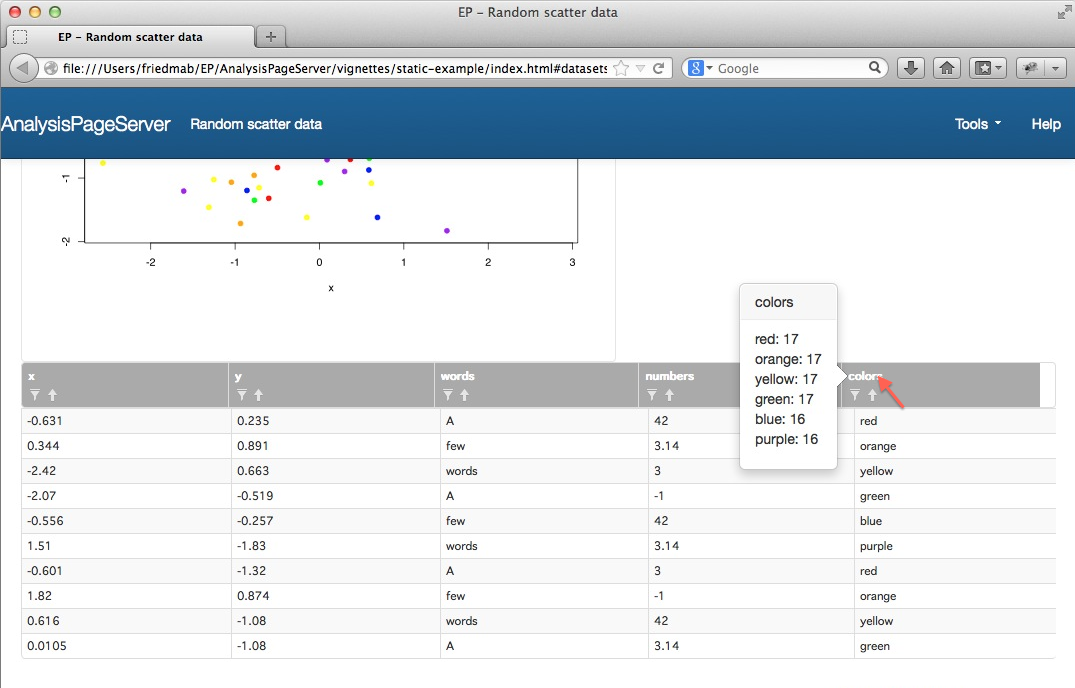
Roll over the column names to see a quick summary of the
contents of the column.
 ### Sort
Click on the sort arrow
  to sort the rows of the table based on that
column. Click again to reverse sort. This example shows the data
reverse sorted on the `y` column:
 ## Filtering
A filter is a selection of a subset of the data. Since there is a
correspondence between rows of the data table and points in the plot
the filter is a applied to both areas---rows corresponding to points
removed from the plot
are removed from the table. Filters can be defined based on the values
of the data. There are two ways to do this: by clicking the filter icon on the column
headings, or using the "Filter Control Area". We'll start with an example
using the column headings.
Click on the filter icon
  to filter the rows of the table based on the
content of a column. Simple text filters and numeric filters are
available, according to the type of data in that column of your
original data frame.
 For example, filtering on "red" will include only the rows where the
colors field is "red".
 Any filter applied to the table is also applied to the plot:
 Note that by including the vector of colors in
the data frame we can allow the user to filter based on the color
of the points. Similarly, by including the `x` and `y` coordinates the
user can filter on the position. See the next section for more on this, and
also the section on tagging for a more intuitive way of filtering on
point position.
The control area to the
right of the plot displays a summary of how many filters you've applied and how
many points remain:

If you click on that you will open up the "Filter
Control Area":
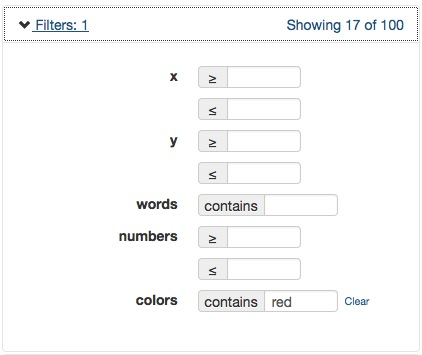
Now you can see all of the filters on all the columns. Right now it is
just the one filter. You could add another filter, for example on the `x` coordinate:
 Now you can see only points with `0 <= x <= 1`. The filter summary
updates to show you've applied three filters (`x >= 0` and `x <= 1`
count as two separate filters), and as a result are only
looking at 6 of the original 100 points. The table is also filtered
down to the 6 corresponding rows.
To clear the filters just click "Clear". For example, you could turn
off just the "red" filter:

And you get points of all the colors, still with the `x` coordinate
filter applied:
 ## Tagging
Tagging allows you to add meta-data to the plot. Click either on the "Tag
Points" area
  , or on the "Tag Mode"
button
  .
.
 (If you are following along this tutorial in order you might have to
clear the `x` filters from the last section to
match this example.)
You can then select a field for tagging from the dropdown menu (this
is populated with the names of the columns in your data frame), and
click "Tag all visible" to add the tags:
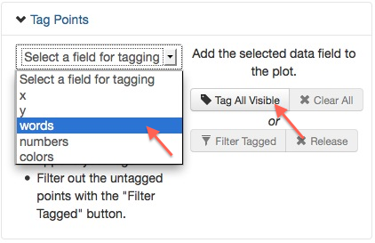
The points are annotated with the data from that column of your data frame:
 If you change the field then it changes the labels:
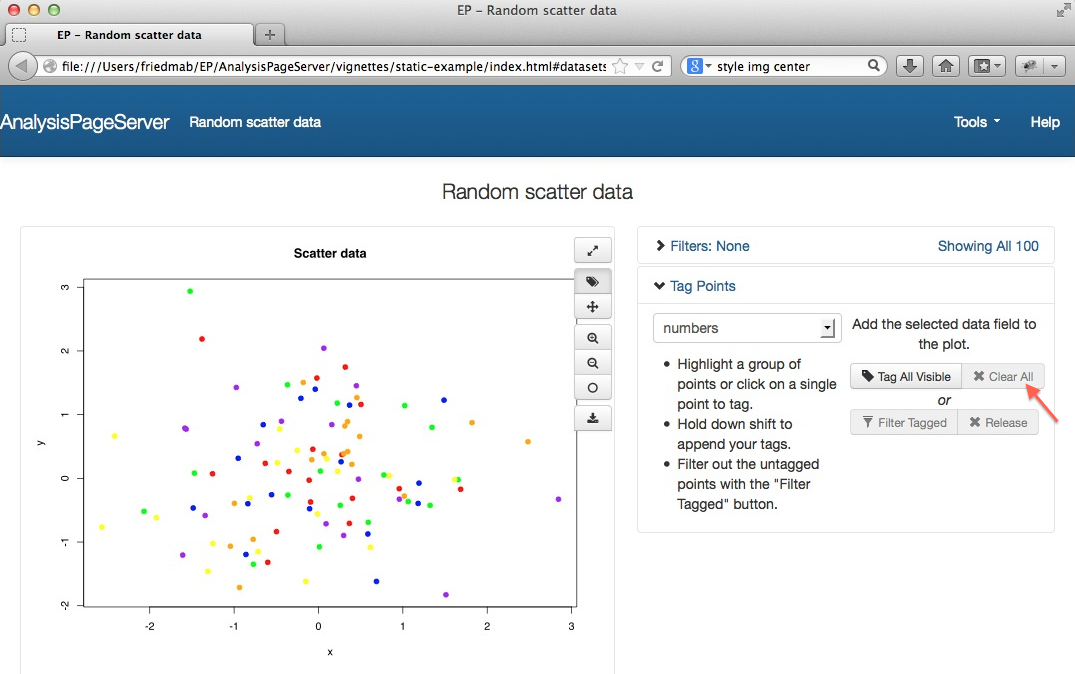
 The tags are draggable, so you can move them around.
Click
  to remove
the tags.
 If you don't want to label all the points, you can select a subset of
points to tag. This can be done by clicking on them or highlighting
them.
 This is what you get:
 Once you have some points tagged, if you want to *add more* tags
without losing the tags you already made then just hold shift while
you click or highlight. Here is the result of *shift*-clicking another
point:
 ## Filtering based on tags
Not only do the tags add more information about the elements of your
plot, you can also use them to define filters. Click
  to hide the
rest of the points:
 The same points will also be removed from the table. Click
  to "release" the
filter (restore all the hidden points).
## Download
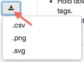 There are three types of downloads available. Each one will download
the data in a way that reflects the current state of filters and
tags. To download simply click on the download button (pictured at
right)
and choose the
download you want.
1. `.csv` downloads the data table as a CSV file, which can be opened
for example in Microsoft Excel. This file will contain comments about
the data being analyzed and the filter applied.
2. `.png` downloads the plot (with current filters and tags) as a PNG
file.
2. `.svg` downloads the plot (with current filters and tags) as an SVG
file.
# Next
[Example Servers](ExampleServers.html)

 ## Roll-over
Rolling over any point in the plot reveals the meta-data associated
with the plot.
 ## Zooming
Zooming is done most easily with your mouse roller, which will zoom
in/out focusing on the point where your mouse is hovering.

 If you
get lost then you can always press the `0` key or click on the "reset
zoom" button, which is the bottom button from the group of zoom
controls (pictured at right). Above the "reset zoom" button are the
incremental "zoom in" and "zoom out" buttons which can be used
instead of the mouse roller zoom.
## Panning
 Once you've zoomed in you might want to move about. If you are in "pan
mode" then you can drag the plot to move it around. The mode
toggles between "pan mode" and "tag mode" (more on "tag mode"
later). "pan mode" is repesented by a 4-way arrow, and "tag mode" by a
tag. Whichever button is depressed is the mode that you are in. For
example, picture at the right shows "pan mode". If you are in the
wrong mode just click on the other button to switch.
## Full screen mode
Clicking on the *full
screen* button
  ## Data Table
Scroll down the web page and you will see a table of your attached
data:
 ### Column Summaries
Roll over the column names to see a quick summary of the
contents of the column.
 ### Sort
Click on the sort arrow
  to sort the rows of the table based on that
column. Click again to reverse sort. This example shows the data
reverse sorted on the `y` column:
 ## Filtering
A filter is a selection of a subset of the data. Since there is a
correspondence between rows of the data table and points in the plot
the filter is a applied to both areas---rows corresponding to points
removed from the plot
are removed from the table. Filters can be defined based on the values
of the data. There are two ways to do this: by clicking the filter icon on the column
headings, or using the "Filter Control Area". We'll start with an example
using the column headings.
Click on the filter icon
  For example, filtering on "red" will include only the rows where the
colors field is "red".
 Any filter applied to the table is also applied to the plot:
 Note that by including the vector of colors in
the data frame we can allow the user to filter based on the color
of the points. Similarly, by including the `x` and `y` coordinates the
user can filter on the position. See the next section for more on this, and
also the section on tagging for a more intuitive way of filtering on
point position.
The control area to the
right of the plot displays a summary of how many filters you've applied and how
many points remain:


 Now you can see only points with `0 <= x <= 1`. The filter summary
updates to show you've applied three filters (`x >= 0` and `x <= 1`
count as two separate filters), and as a result are only
looking at 6 of the original 100 points. The table is also filtered
down to the 6 corresponding rows.
To clear the filters just click "Clear". For example, you could turn
off just the "red" filter:

 ## Tagging
Tagging allows you to add meta-data to the plot. Click either on the "Tag
Points" area
  , or on the "Tag Mode"
button
  .
.
 (If you are following along this tutorial in order you might have to
clear the `x` filters from the last section to
match this example.)
You can then select a field for tagging from the dropdown menu (this
is populated with the names of the columns in your data frame), and
click "Tag all visible" to add the tags:

 If you change the field then it changes the labels:
 The tags are draggable, so you can move them around.
Click
  to remove
the tags.
 If you don't want to label all the points, you can select a subset of
points to tag. This can be done by clicking on them or highlighting
them.
 This is what you get:
 Once you have some points tagged, if you want to *add more* tags
without losing the tags you already made then just hold shift while
you click or highlight. Here is the result of *shift*-clicking another
point:
 ## Filtering based on tags
Not only do the tags add more information about the elements of your
plot, you can also use them to define filters. Click
  to hide the
rest of the points:
 The same points will also be removed from the table. Click
  to "release" the
filter (restore all the hidden points).
## Download
 There are three types of downloads available. Each one will download
the data in a way that reflects the current state of filters and
tags. To download simply click on the download button (pictured at
right)
and choose the
download you want.
1. `.csv` downloads the data table as a CSV file, which can be opened
for example in Microsoft Excel. This file will contain comments about
the data being analyzed and the filter applied.
2. `.png` downloads the plot (with current filters and tags) as a PNG
file.
2. `.svg` downloads the plot (with current filters and tags) as an SVG
file.
# Next
[Example Servers](ExampleServers.html)